
Thursday, December 11, 2014
Friday, December 5, 2014

Thursday, December 4, 2014

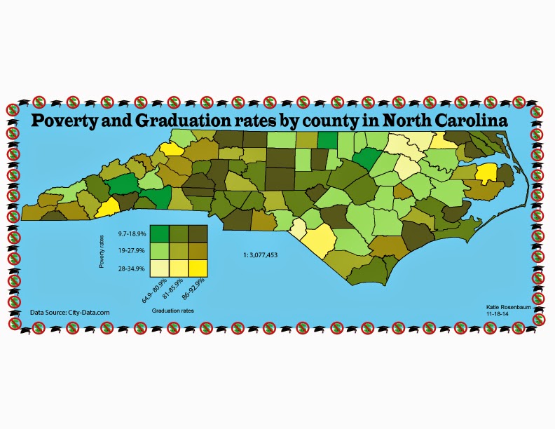
Tuesday, November 18, 2014
last weekly post #10

For this bivariate map it uses the choropleth and proportional symbol method to show the two different variables. you have the proportional symbol which shows the exact population and then the choropleth which shows the percent of rural population.
Tuesday, November 11, 2014

Tuesday, November 4, 2014
Weekly post #9 Dot Density
This map shows the tobacco Agriculture in 2002. You can see that the highest crop population is in southern Virginia to Northern North Carolina along with Kentucky. You can tell becase that is where the most dots are.
Monday, November 3, 2014
Final Project Proposal
For my final project,
I chose to do a map on something of interest to me. I decided to look into the
mapping of hurricanes. I will map the intensity of hurricanes that made
landfall on some part of the United States in 2005. I chose this because
outside of class most of my friends and family know me as a weather nerd, so
following hurricanes and tracking events such as snowstorms and tornadoes are a
true interest of mine.
My intended audience
is our GGS 310 class and anyone else who looks at my blog. I hope to display
the information in a way that someone who is not in the discipline of Geography
will understand what the map is about. I figure the best way to show my data
and for people to see the intensity difference is to do a proportional symbol
map. I hope to find a symbol like the one they use on the weather channel to
show the projected path of hurricanes that are a threat to the United States.
The base map I will need
I would have to get from ArcGIS; showing a map of the states I need. Considering
most Atlantic hurricanes start off the Coast of Africa and end up in the Gulf
of Mexico, I would need the states from the Gulf as well as the states on the
Eastern Seaboard. Due to water
temperature at the peak of hurricane season, some hurricanes take a turn around
the Florida coast and head up the East coast.
My data set comes
from the National Hurricane Center. I decided to go back to 2005 because there
is a difference in the number of hurricanes and the intensity of the hurricanes
so it will give my map some variation. The size of my data isn’t too large but
it is somewhat complex, due to all of the different lines crossing paths of
pervious hurricanes. Finding which hurricane path is which is going to take
some time but the intensities when they make landfall are easy to figure out.
As far as production
goes, I ideally would like to have most of the mapping done before we go into
Thanksgiving. I don’t want to map all of the data in case you all find some
something during final critiques because I don’t want to have to start all over
either. I think having lab time in class is going to be helpful as well and
should keep me on track for finishing most before going into the holiday
instead of having it hanging over me.
I face similar
challenges as with my first proportional symbol map. Making sure my legend
shows the data set well so that others who aren’t in this class know what each
symbol size means. The other challenge I face is in terms of mapping: do I just
map where the storm makes landfall or do I map its track as well? If I map the
track as well how do I make that different from the map that is on the National
hurricane website?
Week #8 isoline map
here is an isoline map showing the temperature difference for the month of May in 2010. the different colors show the either increase in temperature from the average temperature or the decrease from the average temperature.
Friday, October 31, 2014

Tuesday, October 28, 2014

Thursday, October 23, 2014
weekly post #7

Here is a proportional symbol map. It shows the number of hunting license holders per state in 2013. I think it shows the data well although it is somewhat hard to read in the Northeast because all the states are so close together and the symbols are so big so it is hard to see what symbol represents what state.
weekly post #6 color!
I think this map shows color really well and it easily shows the different parts of the country in different colors.
Tuesday, October 21, 2014
Lab #6

Thursday, October 9, 2014


Thursday, October 2, 2014

Tuesday, September 30, 2014
Weekly post #4

Thursday, September 25, 2014
Weekly post #3

http://3oneseven.com/world-map-typography/
So here is a map that I think takes typography to an extreme. With the text showing the borders of the continents it also shows an aspect of size of the country with the size of the text itself.
Tuesday, September 23, 2014
.jpg)
Tuesday, September 16, 2014

Friday, September 12, 2014
Weekly post 2- Projection

So I tried to find a map to represent bakeries around the world but I didn't want to just post a Mercator Projector because we see those all the time! So for this post I focused more on projection than what is being displayed on the map! So I found a Conic projection of the world! I personally think the conic is the coolest projection! Just to be able to see the whole world from a pole is really awesome
http://www.progonos.com/furuti/MapProj/Normal/ProjCon/Img/eu-s100h-0-45-1-0-2-90.png
Tuesday, September 9, 2014

Thursday, August 28, 2014
1st post
a Map of the 2013 Atlantic Hurricane Season
I chose this because I have a big interest for weather and hurricane season.

I chose this because I have a big interest for weather and hurricane season.
Subscribe to:
Comments (Atom)